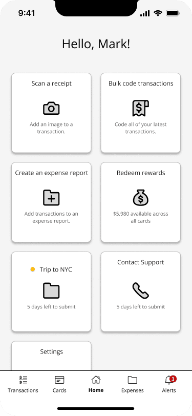
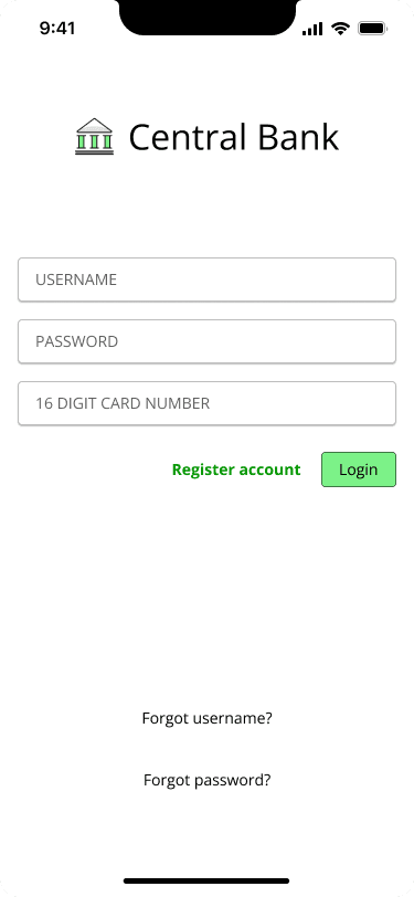
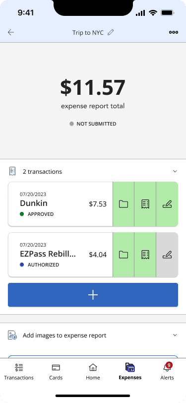
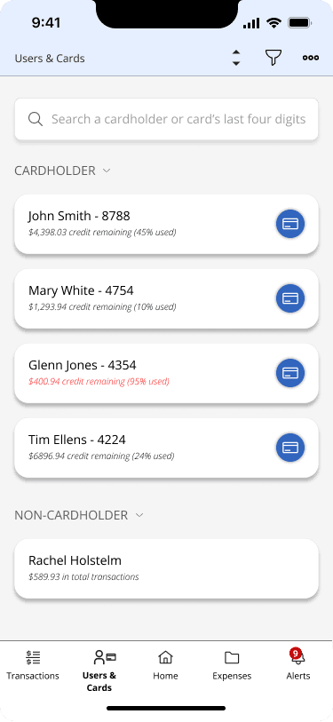
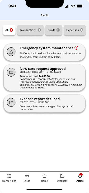
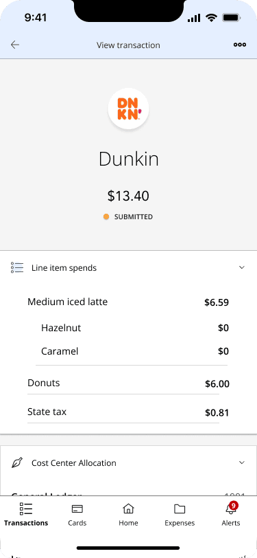
I led the redesign of a legacy expense management platform that reaches over 200,000 thousands end users. I demo'd pixel-perfect designs that won Fiserv a contract worth $20 million from one of Canada's largest banks.
Design Leadership · Enterprise · Fintech · B2B2C · Design Systems · Agile Delivery
Programs used
Figma
Jira
Confluence
The Product
Our solution allows users to manage credit cards, view expenses, and submit expense reports. It is used by some of the world's largest banks and has barely been updated since it was built 20 years ago.
Our Team
I was the sole designer on a team of 40+ people, all of which had no prior experience working with a designer. I introduced UX Design best practices and integrated design into our Agile delivery processes thus modernizing our workflow and increasing Fiserv's overall UX Maturity.
Step 1
Understanding the lay of the land was my first step. This would give me valuable insight into how clients, and end users, feel about our product in its current state.
I integrated clients and end users directly into the rewrite from the getgo by conducting new user research in the form of surveys, user interviews, and client roundtables. I first gained a thorough understanding of our user's thoughts on our product from a top-down level in order to understand the broad sentiments surrounding our product.
I simultaneously conducted user interviews, usability studies, and gathered quantitative data in order to gain a more precise understanding of who our users were and what their pain points were. This allowed me to build the two following personas along with an accompaning user journey.
Step 2
Next, I determined that it was important to understand where the rewrite needed to head. I turned to Product for guidance since they possess knowledge of the platform in its current state and understand our client's needs.
The user research data that I gathered served as the foundation for a series of discussions that I held with our Product team consisting of a Product Manager and three SMEs. I have been collaborating with them since day one by joining their daily standup calls and facilitating design brainstorming sessions. They had never worked with a UX Designer before so it was an opportunity for me to educate them on design best practices and learn the following
An in-depth understanding of all of the technical nuances of the application.
The Product Manager's vision for how the redesign of the application could help clients.
Step 3
I then began outlining requirements as they came from Product, for these served as the foundations of the rewrite. This process technically began during step 2 but it's worth mentioning in greater detail as its own step.
This Information Architecture was crucial for a project of our scale and served the following benefits
It served as our project's singular Source of Truth for keeping track of all requirements.
Making updates to ever-changing requirements is very easy before committing to designs.
It makes designing much easier due to a clear set of guidelines to work off of.
It depicted a clear scope that Tech and Project Management could use to estimate the amount of hours that our project would consume.
Step 4
Step 5
By this point I knew who my users were, what their pain points were, and what Product's vision for the rewrite was. On top of this, I had a clear outline of what my wireframes needed to consist of. This prep work allowed me to make almost all of the wireframes needed for our mobile application in just a few months. I shared my progress with Product every other day to consistently source their feedback and ensure that collaboration never ceased.
Two examples of how I used my personas in order to begin making wireframes are below.
Step 6
I was ready to begin showing my wireframes to clients once all of the requirements were satisfied. Thus I proactively took them to Product, clients, and end users to conduct 20 more usability studies to get the following feedback.
Step 7
It became clear that clients were not a fan of the aesthetic of the previous design. I took to the Internet and used inspiration from many different sources to overhaul the look and feel. After some time I eventually became confident that I had nailed that "modern corporate" aesthetic that my clients wanted from the redesign. I took my designs back to them, and to our end users, for yet another round of feedback.
I also tested the same user journeys to verify that my designs aleviated our user's pain points.
Step 8
I save almost all of my teammates valuable time, thus saving my department money, by being actively involved in our Agile delivery processes. I work in a multi-faceted fashion and interact with almost all of my teammates in some capacity via sprint planning sessions, requirements gathering calls, daily standups, and leadership "Three Amigos" calls.
I also took it upon myself to teach a recent college graduate on our team UX Design in order to double the rate at which we could make designs. Additionally, I lead a two-day long design workshop with our entire team in order to educate others on UX design best practices.
Summary
I lead the complete redesign of a legacy enterprise application by using our users as my foundation. This began with conducting user research, understanding the vision of the product, outlining it in text, wireframing, then iteratively improving. I enabled our department to secure over $20 million dollars in revenue, and have helped prevent more than $5 million dollars worth of contracts from leaving our project, with my designs. Additionally, I streamlined my department's practices by integrating design into workflows thus saving teammates over 10 hours of extra work a week.
Some key takeaways from my work at Fiserv include:
Learning how to lead in an environment of ambiguity and with little direction. I developed the mindset of a "self starter" that executes with confidence.
Using user research as a tool that guides long-term success.
Becoming a master at Figma that can rapidly build pixel-perfect designs.
Establishing myself as a “Design Evangelist” that educates teammates on Design practices in order to integrate design into more archaic workflows.
Work in an agile fashion in a team of 40+ people that spans three timezones.
Lead design sessions that educate teammates on design principles and facilitate creative brainstorming in order to ensure that the design process is interactive and cross-team.
